| ARCHITECT |  |
| INAUGURATED |  |
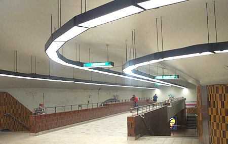
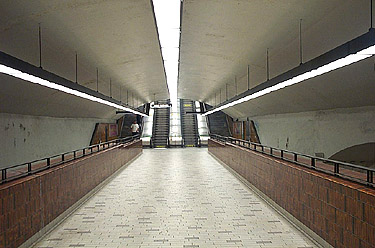
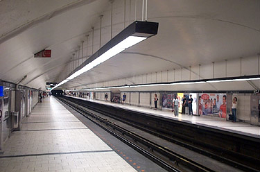
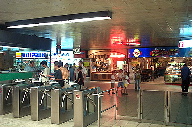
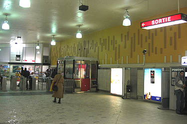
This is a very lackluster station. Formerly, it was done in the ugly orange-brown glazed tile pattern (supplemented by other tertiary colours) that still covers most of the walls in the access areas. The majority of the platform walls have been done over in a more modern style, with multicoloured glazed tile mosaics over the seats, and white stone floors and walls. Although one cannot deny that the look has been much improved, white walls and floor are about as practical in a metro station as carpet in a hospital, and they have quickly become filthy.
|
|

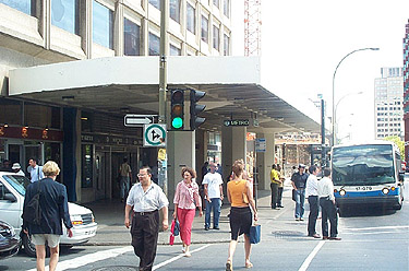
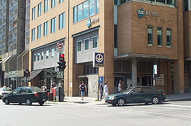
The entrances are also nothing to write home about, being incorporated into the ground floors of two buildings. The mezzanine of the rue Guy entrance also has restaurants, a drug store, and other shops and services, as well as a direct access to three buildings of Concordia University's downtown campus. There is no artwork in the station. All in all, it is not graced with any architectural or artistic advantages whatsoever.
|
